Sonos
Support Site Re-design
A mobile focused update to the Sonos Support site with emphasis on use case versus product organization.
In 2015 I was consulting with Sonos, working alongside the internal teams and directly with their external agency.
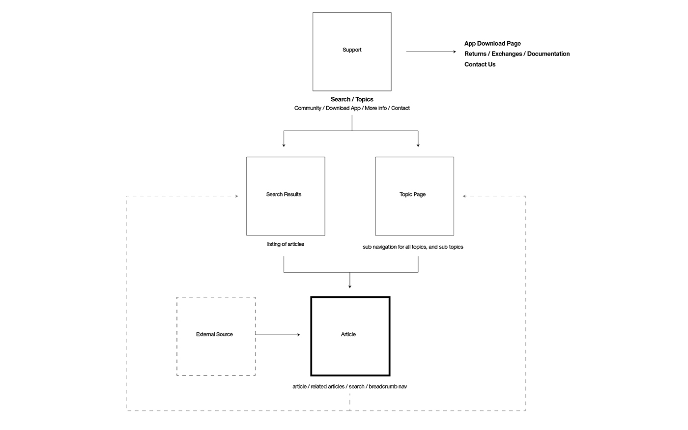
I worked directly with the Global Digital Marketing team, Product team, and Support. We identified issues, discussed hierarchy of information, and ultimately re-architected the support site. The results provided an improved user experience and reduction of inbound support calls.
The problem
Identified that the issue with the existing support site was that it was organized by product. The reality is that customers look by use case. For example, "I want to setup a new product," "I need to find software," or "I threw out my user guide and I need the info now."
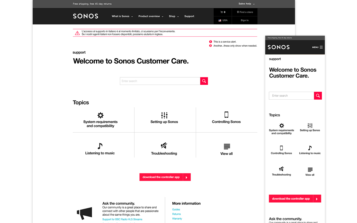
Additionally, the site was not optimized for mobile which is the primary device for people setting up a system.
Solution
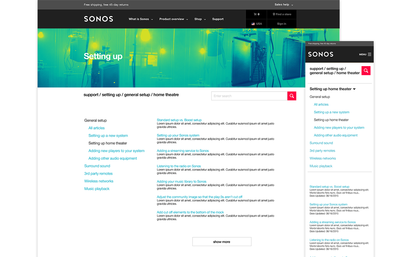
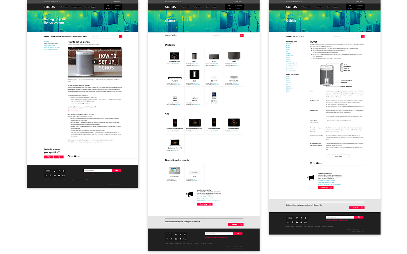
Defining a hierarchy of information, optimized for mobile, and added a direct link to the controller app.
Work

Le Grand Courtage: Shop ExperienceProject type
Hoka: Apparel IconsProject type

NeffProject type

ObrigadoProject type

teva.comProject type
Sonos Support SiteProject type

RubiosProject type

Chef'd WebsiteProject type
Contact
(805) 444-2643
me@grantengland.com
© 2024 Grant England Studio
Made with ☀️ in Ventura, Ca